As a New Zealand artist, colour is more than just part of my process; it's my language. It's how I communicate the parts of myself that don't always come through in words. I'm naturally introverted. I prefer quiet over chaos and reflection over attention-seeking.
That said, you might not guess that if you saw me out in the world, sequins, layered colours, and Doc Martens are pretty standard in my wardrobe. I've always had a thing for unique style, and I guess my clothing, like my art, speaks louder than I do.
When you look at my work, especially my bold, bright pieces, you're seeing that expressive, unfiltered side of me. The one that's full of energy, vibrancy, and unapologetic emotion. My palette isn't just about aesthetics; it's a reflection of how I feel and, sometimes, how I wish the world felt.
Why I Paint with Bright Colours
Bright colours make me feel alive. They bring joy, energy, and a sense of optimism that I think the world needs more of. There's already so much dullness in everyday life: grey skies, beige walls, and neutral clothing. When I pick up a brush, I gravitate toward colours that spark something in me.
Some artists, especially those influenced by minimalism or realism, lean toward softer or muted palettes. These can create a calm, contemplative feel; think of the earthy tones of Colin McCahon's landscapes or the quiet greys and ochres in traditional European still-life paintings. These choices are valid, beautiful, and deeply intentional. But for me, bold is the only way I can truly express what's inside.
Art as a Mirror of My Emotions
That said, my palette doesn't always stay bright. Over the years, I've noticed a pattern, when life gets heavy, my colours shift. During my breast cancer journey, for example, I found myself reaching for dark greys, moody purples, and muted tones. It wasn't conscious at first. But looking back at the art I created during that time, I can see the emotional weight in every brushstroke.
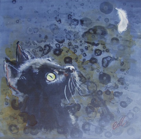
I can Wait - Cat portrait by Collette Fergus
Artists across time have used colour as a window into emotional and psychological states. Frida Kahlo, for example, often used deep reds and earthy tones to convey pain and passion.
Picasso's famous Blue Period captured grief and hardship through a palette dominated by blues and greys. These shifts in tone are powerful because they don't just depict a scene; they tell a story about the artist's internal world.
Beige? No Thanks Unless It's Supporting Brights
There's one colour I have a strong opinion about: beige. To me, beige is the visual equivalent of saying nothing at all. It can have its place in a painting, sure, but only as a supporting act. I'll use beige sparingly to highlight and contrast the brightness I love, but it'll never be the star of the show. Life's too short to live in muted tones.
Other artists often use beige or neutral tones to achieve balance, especially in interior design-focused work, where calm, non-distracting art is preferred. But for me, art is meant to wake you up. I want my colours to energise a room and lift a mood. My version of balance is using a pop of shocking pink next to a splash of turquoise, not toning things down.
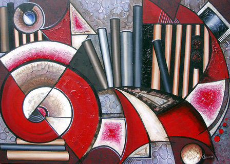
Art-chitecture Abstract by Collette Fergus
Seeing the World Through a Vivid Lens
I once attended an art class where we were all asked to paint the same local scene. Same view, same composition. But when we revealed our finished pieces, mine stood out instantly, not because it was better, but because the colours were completely different.
While others had chosen realistic greens and browns, I'd instinctively painted what I saw, a world bursting with saturated colour and personality. That's the thing: I see vibrant first. It's just how I'm wired.
Many artists train their eyes to match what's in front of them, a skill that's incredibly important in realism. However, expressive artists, such as those in the Fauvist movement (think Matisse or Derain), prioritised emotional colour over accurate representation.
They painted skies orange and trees purple, not because that's how things looked, but because that's how they felt. I relate deeply to that approach.
In the painting below, I was strugglnig with difficult times, a badly broken leg ended my 'real job' career, so a lot of deep soul searching occured and this piece speaks of the unhappiness and stress I wanted to put behind me but also optimism for the future represented by the well lit emerald green dress, something I felt represented what I experienced at that time.
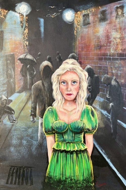
The Girl In The Emerald Green Dress by Collette Fergus
The Emotional Role of Colour in My Work
Every painting I create tells a story, and colour plays a leading role. It shows the viewer not just what I see but how I feel. My use of colour is my way of inviting people into my world, one that's sometimes loud, sometimes soft, but always honest.
Whether I'm painting pop art pet portraits, bold abstracts, or custom commissions, my work is infused with colour that reflects real human emotion. And as a New Zealand artist, I'm proud to offer work that connects with people on that deeper, more colourful level.
Looking for NZ Art for Sale?
If you're someone who feels joy in colour and who wants to brighten their walls (and maybe even their mood), I invite you to explore my original works. I offer a range of NZ art for sale, from bold abstract pieces and vibrant landscapes to highly personalised pop art pet portraits that are full of personality and soul.
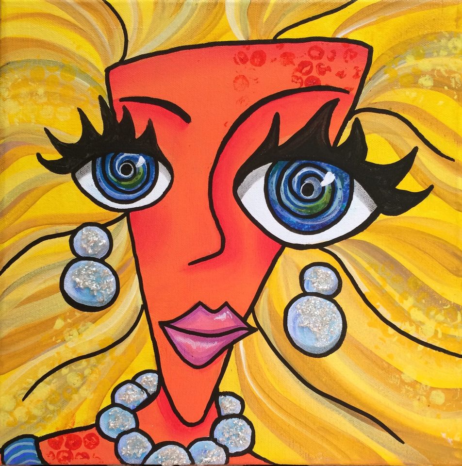
Pop art has played a huge role in shaping my artistic voice. I was drawn to it for its unapologetic brightness, its playful nature, and the way it celebrates everyday subjects in larger-than-life ways. In many ways, it gave me permission to be bold, not just with colour but with style and subject matter, too.
My pop art pieces often exaggerate features, layer unexpected colour combinations, and lean into the quirky side of life. They're a celebration of individuality, whether I'm painting a cheeky pug or an expressive cat with hot pink highlights.
Over time, I've blended the pop art aesthetic with my own sense of emotional storytelling, bringing in colour not just for its visual impact but for its deeper meaning. When you purchase a piece from me, you're not just buying decor. You're collecting a part of my story, my experiences, and my heart, whether that's one of joy, resilience, or reflection.
I believe art should spark something in you, whether it's a memory, a mood, or simply a smile. If that resonates with you, I'd love for you to browse my available works. And if you're after something personal, I also welcome commissions that let us collaborate to create something truly meaningful.
As a New Zealand artist, nothing makes me prouder than seeing my work brighten homes across Aotearoa and beyond. Contact me now!