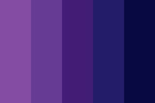
Let's examine the captivating world of purple in our colour exploration.
Creating purple requires a vibrant mix of a warm primary colour (Red) and a cool primary colour (Blue). Therefore, purple is a hue that embodies warmth and coolness. In nature, this intriguing colour is very much revered, seen in delicate flowers like lavender, orchid, lilac, and violet and is considered the colour of royalty.
Join me as we explore the mystique of purple and uncover its many shades and meanings.
The Psychological Impact of the Colour Purple
Purple is a colour that can profoundly influence our emotions and perceptions. It can have varying effects in a room depending on the shade and context. For example:
- Stimulating Imagination: Purple can stimulate imagination and creativity in a child's room. Its mystical and magical associations, especially with fairy tales and fantasy, can create a whimsical and inspiring environment.
- Enhancing Creativity: For artists, purple can enhance creativity and artistic expression. It is often associated with introspection and spiritual reflection, some great qualities that can be beneficial for creative endeavours.
- Moodiness and Depression: Purple can be effective when used appropriately, but there are unfortunately limitations to its use. Such as excessive use of dark or saturated purples can create a rather sombre atmosphere, leading to feelings of moodiness or even depression. This is why it's generally advised to avoid painting entire walls in deep purples, especially in spaces where you might spend a lot of time, such as bedrooms, studios or offices.
- Balancing with Other Colours: To mitigate the potential negative effects of purple, it can be paired with other colours to create a balanced and harmonious environment. For example, combining purple with lighter, uplifting colours like yellow or white can create a more cheerful and balanced space.
By understanding the psychological impact of purple, we can use it more effectively in our living and working spaces, harnessing its positive attributes while also avoiding its potential pitfalls.
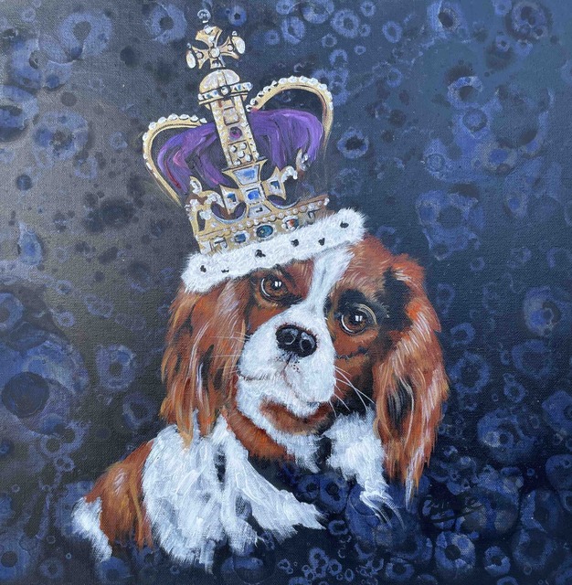
King Charles - Pet Portrait by Collette Fergus
Cultural Significance
It's interesting to know that the colour purple has a rich and varied cultural significance, deeply rooted in history and tradition. Here are some key aspects:
- Mourning in Thailand: In Thailand, purple is the colour of mourning for widows. It is worn during funeral rites and symbolises sorrow and respect for the deceased. This tradition reflects the sombre and respectful nature of purple in Thai culture.
- Historical Figures: Its well known that purple has been favoured by notable historical figures especially royalty, including Egypt's Queen Cleopatra. Cleopatra was known for her luxurious and extravagant lifestyle, and purple was a colour that became associated with royalty and nobility in ancient Egypt. Similarly, the iconic 1980s pop star Prince (pictured below) known as the Purple Prince, he famously incorporated purple into his career and wardrobe, this further enhanced its status as a symbol of individuality and creativity.
- Royalty, Nobility, and Spirituality: As mentioned above, purple has long been associated with royalty, nobility, and even spirituality in many cultures. In ancient Rome, purple symbolised status and power, as only the wealthy could afford the expensive dye used to create the colour. Whie in Christianity, purple is often associated with Lent and Easter, symbolising penance, royalty (for Jesus), and the resurrection.
- Symbolism in Art and Literature: In art and literature, purple is often used symbolically to represent royalty (such as in the pet portrait shown above), luxury, and spirituality. Its rich and deep hue can evoke a sense of grandeur and mystique, adding depth and meaning to artistic works.
By understanding the cultural significance of purple, we can appreciate its role in history and society and its continued relevance in art, fashion, and culture today.
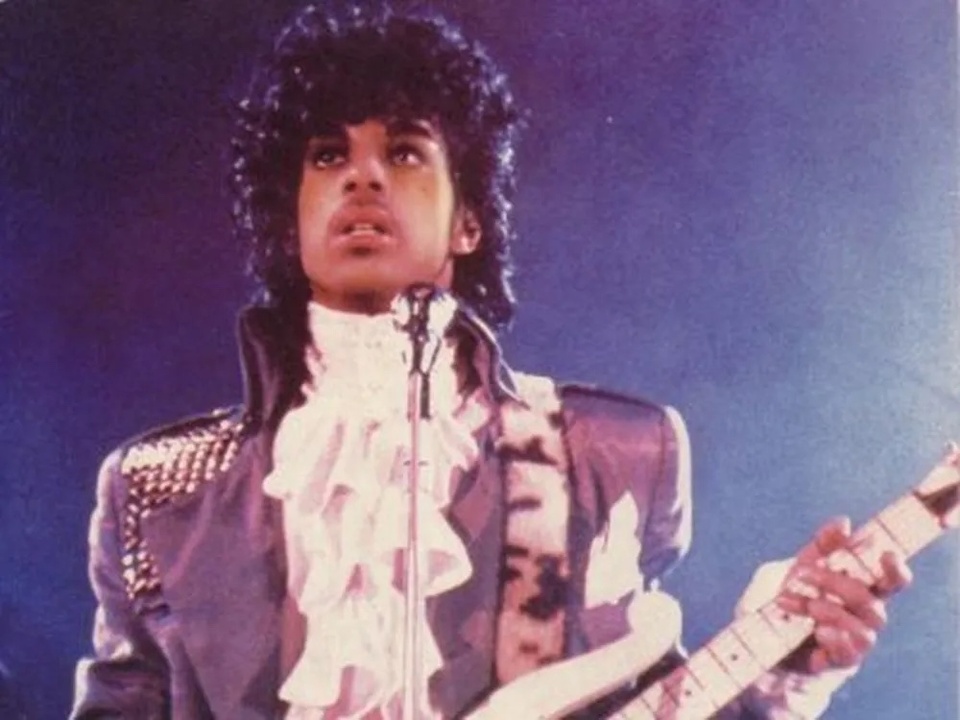
The Purple Prince
Artistic Perspective
In art, purple is a colour that holds a unique and intriguing position. Here's a closer look at its significance:
- Position on the Colour Wheel: Purple falls between magenta and violet on the colour wheel, encompassing a range of tints and shades. This placement gives it a dynamic quality, allowing artists to use it to create depth and contrast in their work.
- Definition in Colour Theory: According to colour theory, purple is defined as any non-spectral colour between violet and red, excluding violet and red themselves. This definition highlights the varied nature of purple, which can be in any shade and intensity. Burgundy is often confused as purple.
- Professional Perspective: While the layman's idea of purple may lean towards dark violet, professional artists often define purple as a more red-violet colour. This distinction is important in the Munsell colour system, where purple is seen as a distinct hue, separate from violet and red. This allows artists to have a broader range of colours to work with, enhancing the complexity and richness of their compositions.
- Symbolism and Usage: Purple has long been used symbolically in art, representing royalty, spirituality, and mystery. Artists often use purple to evoke a sense of luxury, depth, and emotion in their work, adding layers of meaning and symbolism to their compositions.
By understanding the artistic perspective of purple, artists can effectively use this versatile colour to enhance their work and convey rich and complex themes to their audience.
Colour Combinations With Purple
Purple is a versatile colour that can evoke a range of emotions depending on its shade and context. Here are some common colour combinations and the feelings they convey:
- Deep or Bright Purples: These shades suggest richness, luxury, and sophistication. They can create a sense of opulence and drama in a composition.
- Light Purples like Mauve: Lighter shades of purple, such as mauve, evoke a sense of romance, nostalgia, and delicacy. They can create a soft and dreamy atmosphere.
- Mixing Redder Purples: Mixing red into purple creates a warmer colour scheme. This can evoke feelings of warmth, passion, and energy.
- Mixing Bluer Purples: Adding more blue to purple creates a cooler colour scheme. This can evoke a sense of calmness, tranquillity, and serenity.
Artists' Paint Colors for Mixing Purple
- Alizarin Crimson: Mix with Ultramarine Blue for a deep, rich purple with a warm undertone.
- Cobalt Blue: Mix with Permanent Rose for a bright, cool-toned purple.
- Ultramarine Blue: Mix with Permanent Rose for a deep, cool-toned purple.
- Permanent Rose: Mix with Phthalo Green for a muted, earthy purple.
Examples Of Ideal Colour Combinations:
- Purple and Yellow: Combining purple with yellow creates a striking and energetic colour scheme. This combination is vibrant and attention-grabbing, perfect for creating a lively and cheerful atmosphere.
- Purple and Blue: Mixing purple with blue offers a serene and calming effect. This combination is soothing and peaceful, ideal for creating a relaxing and tranquil environment.
- Purple and Orange: Combining purple with orange creates a bold and dynamic colour scheme. This combination is vibrant and energetic, perfect for creating a lively and exciting atmosphere.
- Purple and Grey: Mixing purple with grey offers a sophisticated and modern look. This combination is elegant and understated, ideal for creating a stylish and chic atmosphere.
By experimenting with different shades of purple and combining them with other colours, artists can create visually striking compositions that evoke a range of emotions and moods.
Additional Tips
- Keep a basic colour chart when working on commissions, as colours like purple can sometimes morph into unexpected shades.
- Experiment with different combinations of purple to create unique and captivating colour schemes.
Conclusion
As we have seen, purple is a captivating colour that holds a special place in art, culture, and psychology. Its ability to evoke a range of emotions, from mystery and royalty to romance and creativity, makes it a versatile and powerful tool for artists and designers.
By understanding the multiple variations of purple, including its many shades, cultural significance, and artistic applications, creators can use it effectively in their work to convey complex themes and emotions. Whether used as a dominant hue or in combination with other colours, purple has the power to create captivating and meaningful compositions that resonate with audiences.
Here Are Some Other Colour Explorations For You To Check Out -
- 50 Powerful Shades Of Grey? The Thrilling Colours In Art
- Beautiful Blue: The Depth of Sea to the Sky and Beyond
- In the Pink: Celebrating Valentine's Passionate Colour
- Stunning Silver: The Best Metallic Colour with Class and Glamour
- The Best of Black: The Mysterious and Luxurious Shade
- The Gloriousness of Gold: Unleashing its Luxury and Passion
- Yellow: The Happy Glowing Hue That Makes Warmth and Inspiration
- What Is The Colour Burgundy Or Claret, Colours Or Wines?
- Whiter Shade of Pale: Exploring the Simplicity of White
- Rich as Red: Exploring its Many Fiery Shades
- Blazing with Energy: Embracing the Fiery Spirit of the Color Orange
- Glorious Green: The Awesome Yet Envious Colour of Emeralds