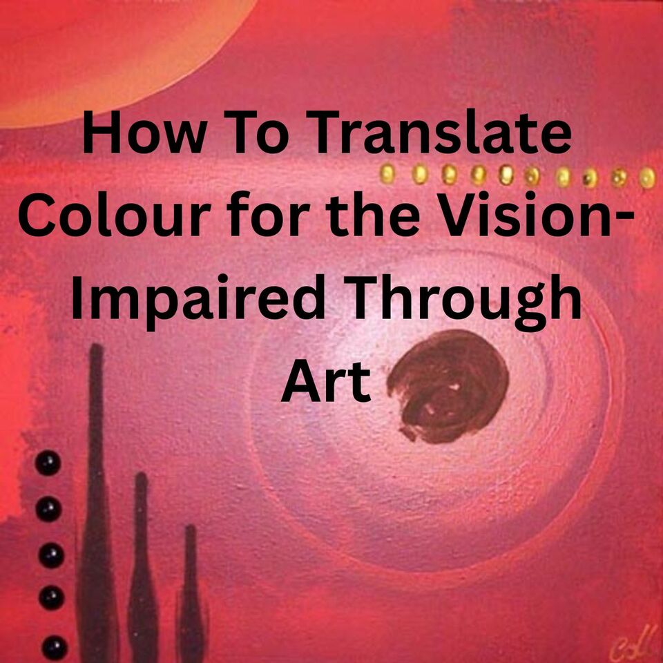
A personal story about emotion, texture, and making art more inclusive by Collette Fergus, a New Zealand Artist with a passion for making art more inclusive.
As a New Zealand artist who paints vivid, emotion-driven artworks, colour is more than just pigment on canvas to me, it's the heartbeat of my creative expression. But a question I was once asked reshaped the way I think about painting:
"How would you describe colour to someone who has never seen it?"
That question rooted itself in my heart. I realised that while colour may not be visible to all, it can still be felt, heard, even understood, through texture, story, and sensation.
This blog is my attempt to share what colour means and how, as an artist, I now intentionally use texture to create art that's more inclusive, especially for the vision-impaired.
The Day Maria Changed the Way I Paint
A number of years ago, at one of my exhibitions in Hamilton, a woman named Maria attended with her sister. Maria had been blind since birth. As she gently explored my painting, one layered with gritty pumice and smooth gloss gel, she paused and said something profound:
"I can feel what your colours must be doing."
That moment shifted my perspective. It made me realise I wasn't just painting for the eyes anymore, I was painting for the soul, for touch, and for those who experience the world differently.

What Colour Feels Like
Describing colour to someone who has never seen it is like explaining music to someone who's never heard. So instead of talking in visual terms, I translate colour through the senses:
Red
Red is fire on your skin. It's the thump of your heart when you're excited or angry. It's the texture of crushed velvet and the clang of a cymbal in a flamenco rhythm.

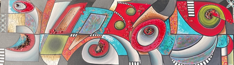
'The Cat in The Hat Stares Back' abstract painting by Collette
Blue
Blue is cool breath against your cheek. It's the soft hush of waves or a quiet voice. It's smooth silk between your fingers, calm and expansive.
Yellow
Yellow is the sun on your face after days of grey. It's the taste of citrus and the giggle of children. It's a fizzy, happy, electric feel.
Green
Green is the scent of damp grass after rain or freshly mown lawns. It's a sense of grounding, of being barefoot on moss. It's quiet growth, balance, and harmony.
Black
Black is the cool stillness of night. Its mystery and depth are like the silence between notes in a haunting melody.
White
White is breath. It's fresh linen, snow falling, and the feeling of starting over. It's quiet but powerful.
Even without sight, these sensations stir emotion. Colour isn't just something we see, it's something we feel.
'Multicultural Land' an artwork by Collette
How I Use Texture to Make My Art Accessible
As a New Zealand artist, my surroundings often influence the sensory aspects of my work, coastal textures, moody skies, vibrant flora. But beyond aesthetic choices, I now create what I call 'sensory art', using materials that invite exploration through touch, helping make my artwork more 'readable' to the vision impaired.
Materials I Use for Sensory Art:
- Glossy varnishes: These areas feel smooth and slippery, like wet paint or sunlight on water.
- Coarse pumice and gel mediums: These add grit and weight, often representing earth, heat, or emotional tension.
- Shells, crushed glass, and natural elements: These textures evoke the New Zealand landscape—our beaches, forests, and coastal energy.
- Smooth modelling pastes: These bring softness and flow, used in places where the painting offers relief or calm.
- Multiple paint layers: My brushstrokes are often intentionally thick and directional, making the emotional flow of the work physically traceable.
You could close your eyes and still understand where the painting surges, pauses, or builds tension.
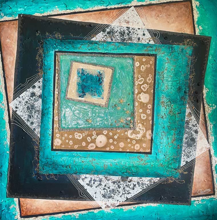
'Unsquared' abstract painting with texture by Collette
Why Accessibility in Art Matters
Art has always been a language beyond words. And yet, we often assume that only the eyes can interpret it. I want to challenge that.
As a New Zealand artist, I believe art should speak to everyone. By adding mixed media texture, I create a new layer of meaning, something that can be felt and experienced by anyone, whether or not they can see it. It's a way of inviting people into the world I paint, with all its emotional intensity, even if they can't see the colours.
Final Thoughts from a Colour-Obsessed Artist
Whether I'm painting a pop art pet portrait full of attitude, or an abstract piece bursting with emotional energy, my aim is to tell stories. Stories that aren't just seen, but felt.
Colour is more than visual. It's a full-body experience. And if my art can make someone feel the emotion behind a crimson splash or the peaceful lull of turquoise without ever seeing it, then I've truly succeeded.
Explore My Art
Want to explore my textured, emotional, colour-soaked world of art? Visit www.collette.co.nz and see what speaks to you, whether it's through your eyes, your hands, or your heart. I'd love to hear about your experience. Contact me now.