The Spectacular Spectrum: A Deeper Dive Into Colour Mixing
When it comes to being an artist, a basic understanding of colour theory and the colour wheel is like having a secret toolkit for every artist, unlocking endless possibilities in your work. As artists based in the vibrant landscapes of New Zealand, we know that colours are more than just tools; they're the essence of our craft, echoing the beauty of our surroundings.
Mastering Hue, Value, and Saturation
The fundamental trio of hue, value, and saturation dances on our palettes, guiding the rhythm of our creations. Experimenting with these elements elevates our work, bringing it to life with a dynamic interplay of colours.
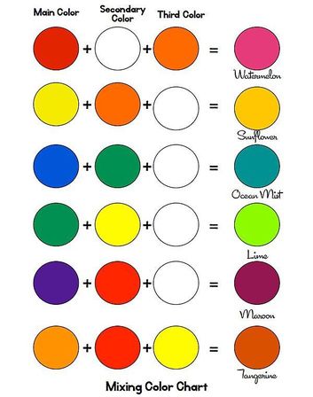
For example, mixing red with yellow creates an orange hue, while adding blue transforms yellow into a lively green. The dance of values and saturation adds depth, ensuring our artworks sing with complexity and vibrancy.
Different colour combination suggestions to enhance your artistic palette:
- Classic Warm Tones:
- Hue: Cadmium Yellow + Alizarin Crimson
- Result: Create a range of warm oranges and reds by adjusting saturation and value.
- Cool Oceanic Blues:
- Hue: French Ultramarine Blue + Phthalo Turquoise
- Result: Dive into a spectrum of tranquil blues, perfect for seascapes or serene landscapes.
- Earthly Greens:
- Hue: Permanent Green Light + Cadmium Yellow
- Result: Craft rich, natural greens for lush foliage or rolling hills.
- Mystical Purples:
- Hue: Alizarin Crimson + French Ultramarine Blue
- Result: Mix these hues to conjure deep purples with varying degrees of intensity.
- Vibrant Greens and Yellows:
- Hue: Permanent Green Light + Cadmium Yellow
- Result: A lively combination of vibrant flora and bright, sunlit scenes.
- Warm Grays:
- Hue: Deep Ultramarine Blue + Deep Green + Deep Violet
- Result: Balance cool and warm tones to achieve a variety of greys suitable for diverse subjects.
- Playful Pastels:
- Hue: Cadmium Yellow + Alizarin Crimson + French Ultramarine Blue (lightly mixed)
- Result: Soft pastel shades perfect for dreamy, whimsical compositions.
- Contrasting Complements:
- Hue: Mix complementary colours like Red and Green, Blue and Orange, Yellow and Purple
- Result: Explore the dynamic interplay of contrasting hues to create bold, eye-catching contrasts.
- Nature-Inspired Neutrals:
- Hue: Earthy tones like Burnt Sienna + Raw Umber
- Result: Achieve natural, muted colours inspired by the New Zealand landscape.
- Experimental Accents:
- Hue: Introduce unexpected hues like Turquoise or Magenta
- Result: Inject a touch of surprise into your palette, sparking creativity and spontaneity.
Remember, the beauty of art lies in exploration and finding your unique voice. Feel free to mix and match these suggestions, creating your own signature colour combinations that resonate with the spirit of your New Zealand-inspired creations.
The Art of Making Black
The age-old debate of tube black versus DIY still resonates within our artistic circles. Using pre-mixed black doesn't diminish your artistry; it's about personal preference and convenience. Personally, I often opt for tube black, but there's a certain satisfaction in crafting your own.
Mix yellow, red, and blue, but remember, the choice of specific hues matters. Deep ultramarine, green, and violet conjure a cool black, while a dash of orange or red adds warmth to create a variety of greys.
Crafting Your Personal Colour Wheel: A Palette of Possibilities
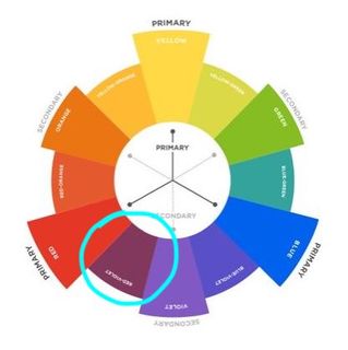
Commercial colour wheels are undeniably helpful, but the real magic unfolds when you take the reins and craft your own. It's a voyage into the heart of your artistic preferences, where your chosen hues become the stars of your creative universe.
Choosing Your Primary Heroes:
Begin by selecting your primary colours, which should connect you to your art. For me, these hues are the enchanting French Ultramarine Blue, the rich Alizarin Crimson Red, and the sunlit Cadmium Yellow. These hues are the foundation for your personal palette and reflect your artistic identity.
Expanding Horizons Outward:
As you start creating your colour wheel, imagine each stroke as a step into the vast possibilities of your artistic expression. Expand outward from your primary trio, dividing the wheel into segments that echo the symphony of your chosen colours. This isn't just a wheel; it's a canvas awaiting the strokes of your creativity.
Showcasing Unique Blends:
Let the colours mingle and dance within each segment, revealing the unique blends that arise from your chosen palette. Watch as the hues seamlessly transition from one to another, creating a visual roadmap of possibilities. These are not just colour combinations but harmonies that resonate with your artistic soul.
Simplifying Complexity:
Your personal touch simplifies the complexity of colour choices. No longer confined to pre-determined schemes, you hold the brush that paints your artistic narrative.
This bespoke colour wheel isn't just a tool; it's a guide that streamlines your palette, making the selection process an intuitive and enjoyable experience.
A Problem-Solving Companion:
Your crafted colour wheel becomes more than just a visual delight; it transforms into a problem-solving companion. When faced with the intricacies of colour choices, consult your wheel.
Need a subtle transition? Your wheel whispers the perfect blend. Searching for a bold contrast? It's there, waiting to be discovered. It's an artistic compass navigating you through the maze of possibilities.
In New Zealand-inspired art, where landscapes shift from dramatic mountains to serene coastlines, your personal colour wheel becomes a testament to your connection with nature's palette.
It's not just about mixing colours; it's about curating a collection that resonates with the essence of your surroundings, ensuring each stroke tells a story uniquely yours. So, embrace the magic within your palette and let your personal colour wheel guide you through the kaleidoscope of artistic possibilities.
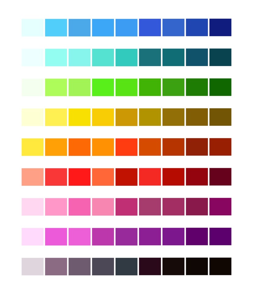
Beyond the Basics: Your Colour Chart
A step further than the wheel, a personal colour chart provides a visual symphony of your preferred hues. Thin down your usual colours by 50%, creating vertical strips in a rainbow-like order.
Let them dry, then cross them with horizontal strips, revealing the alchemy of your palette. This exercise unveils the interactions between colours, exposing their translucency or opacity, and providing clarity for your artistic choices.
Considering Texture and Medium
Move even further into the finer details of your palette by considering the texture of your paints and their behaviour with different mediums. Texture pastes can be game-changers, altering the finished hue.
Create a comprehensive chart that includes these variations, becoming your go-to reference for achieving the perfect texture in your work.
Embrace Individuality
There's no "one-size-fits-all" colour wheel or palette in the vast world of art. Art is about personal expression, and each artist's unique approach deserves celebration.
The beauty of painting lies in continually rediscovering your personal colour wheel, and for me, mine is bold bright and fabulous, rejecting rigid systems in favour of intuition and experimentation.
Closing Note: Embrace the Unexpected
As Kiwi artists, let's not shy away from the unknown. Dive into unexplored hues, play with new colours, and allow the unexpected to happen. Sometimes, the most surprising combinations birth the most extraordinary masterpieces.
After all, there are no mistakes in the realm of art—only new discoveries waiting to be made.
Posted: Monday 11 January 2010