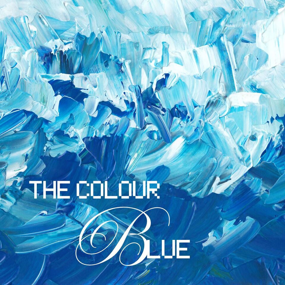
Beautiful Blue: From Sea to Sky and Beyond
As a
New Zealand artist, I’m constantly surrounded by blue, the Pacific stretching endlessly, winter skies heavy with rain, alpine lakes, and that unmistakable coastal light that seems to tint everything it touches. Blue is everywhere, yet it remains one of the most emotionally complex colours an artist can work with.
Blue is not a colour I instinctively reach for, it feels cool, distant, even melancholic. I use it deliberately, aware of its unique emotional complexity. Blue can create depth, atmosphere, and emotional weight, while offering calm, clarity, and strength. To underestimate blue is to miss its true expressive power, both for artists and viewers.
So what makes blue so captivating?
Blue is one of the three primary colours, sitting firmly on the cool side of the colour wheel. Unlike red, which advances visually, blue recedes, a powerful tool for artists wanting to create space, distance, and perspective.
Emotionally, blue occupies a wide range. We feel blue when we’re low, yet we also associate blue with peace, trust, stability, and reflection. This duality makes it endlessly fascinating. Soft blues can soothe and quiet the mind, while intense blues energise and demand attention.
Scientifically, blue is known to trigger calming responses in the body, helping to slow breathing and heart rate. But introduce saturation or contrast, and that calm can shift into drama, making blue a perfect substitute for red when you want impact without heat.
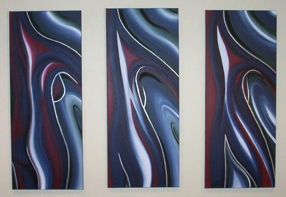
Abstract nude painting using cool blues and the colour burgundy
Blue Through Art History
Blue hasn’t always been easily accessible. Historically, it was one of the most expensive pigments available. Natural ultramarine, made from crushed
lapis lazuli imported from Afghanistan, was once worth more than gold and reserved for the most sacred subjects.
Some of the most powerful moments in art history revolve around blue:
- Pablo Picasso’s Blue Period (1901–1904), dominated by muted blues and blue-greens, these works explore grief, poverty, and isolation. The limited palette intensifies the emotional weight rather than dulling it.
- Johannes Vermeer used ultramarine masterfully in works like Girl with a Pearl Earring, allowing blue to convey intimacy, light, and stillness.
- Hokusai’s The Great Wave off Kanagawa relies on Prussian blue to create both beauty and terror, a reminder of nature’s power.
- Yves Klein went so far as to patent his own blue (International Klein Blue), using it to explore infinity, spirituality, and the immaterial.
Blue is not passive in art history; it is commanding, symbolic, and deeply expressive.
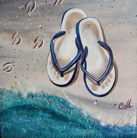
Blue Jandals painting
Blue Pigments Artists Actually Use
Not all blues behave the same, and understanding pigment personality is key.
- Phthalo Blue (Green Shade or Red Shade) — extremely strong, staining, and intense with a vivid, almost electric hue. Even a small amount can dominate a mix, making it highly effective for capturing the rich, saturated blues of deep oceans, dramatic skies, and bold abstract compositions.
- French Ultramarine — a warmer blue with a hint of red, known for its transparent quality and ability to create granulated textures. Its rich, vibrant tones make it ideal for painting shadows, florals, and atmospheric layers, especially in mountainous and lake landscapes.
- Cobalt Blue — a soft, slightly muted blue that tends to granulate, offering gentle transitions. Its delicate, even colour makes it well-suited for painting smooth skies.
- Cerulean Blue — light, airy, and with a slight green undertone; produces a tranquil, sky-like effect. This is my favourite blue for clear daytime skies.
- Prussian Blue — a deep, moody blue with noticeable green undertones, known for its intensity and ability to evoke emotion and atmosphere. It has significant historical importance as an artist pigment.
- Indigo — dark, mysterious, and ideal for night scenes and shadow work. It is fun to use, especially as a hint of black rather than true black.
Each blue has its own temperament. Some dominate mixes, others soften them. Learning this relationship is essential for confident colour use.
Complementary & Harmonious Colour Pairings
Blue’s true strength emerges when paired thoughtfully.
Complementary Pair: Blue + Orange
Opposites on the colour wheel, this combination creates immediate energy and contrast. Burnt orange against ultramarine feels earthy and grounded; bright orange against cerulean feels bold and contemporary.
Analogous Harmony: Blue + Green
These neighbours create calm, natural palettes and are perfect for landscapes, ocean scenes, and botanical abstraction. Phthalo blue with viridian or sap green feels really fresh and fluid.
Blue + White
Classic and timeless. White lifts blue, while blue also makes white appear whiter. It creates clarity and space, which is essential in coastal, minimalist, and nautical works.
Blue + Neutrals
Pairing blue with beige, tan, stone, or warm grey creates a sense of balance and sophistication. For example, robin’s egg blue with soft browns evokes nature without becoming literal.
Blue + Metallics
Deep navy or midnight blue paired with silver or gold instantly elevates a piece, adding a sense of luxury and quiet drama.
Seasonal & Emotional Shifts in Blue
- Pastel blues suggest spring, innocence, and lightness.
- Mid-tones feel expansive and calm, ideal for open skies and water.
- Deep blues belong to winter, night, and introspection.
Interestingly, very dark blues often feel warmer emotionally than pale blues, which can appear icy or distant.
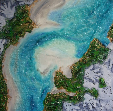
The Key: New Zealand Abstract Art
The Vast Blue Spectrum
Blue is anything but singular. Within its spectrum live endless personalities:
Royal, navy, midnight, cobalt, cornflower, indigo, periwinkle, Wedgwood, denim, slate, sapphire, lapis lazuli, turquoise, aquamarine, electric blue, powder blue, sky blue, baby blue, cerulean, ultramarine, Prussian, air-force blue.
Each variation shifts mood, depth, and meaning. And while many of these names appear across paint ranges, pigments and undertones vary widely between brands, something every artist learns through hands-on experience.
Final Thoughts on Blue
Blue is not just a background colour or a safe choice. It is emotional, historical, and deeply expressive. Used thoughtfully, it can whisper or roar, comfort or confront.
Perhaps that’s why I return to it cautiously, but always with respect.
Continue Exploring Colour
If colour fascinates you as much as it does me, you may also enjoy:
50 Powerful Shades Of Grey? The Thrilling Colours In Art
In the Pink: Celebrating Valentines Passionate Colour
Shades of Purple: A Trip into the World of Royalty
Stunning Silver: The Best Metallic Colour with Class and Glamour
The Best of Black: The Mysterious and Luxurious Shade
The Gloriousness of Gold: Unleashing its Luxury and Passion
Yellow: The Happy Glowing Hue That Makes Warmth, and Inspiration
What Is The Colour Burgundy Or Claret, Colours Or Wines?
Whiter Shade of Pale: Exploring the Simplicity of White
Rich as Red: Exploring its Many Fiery Shades
Blazing with Energy: Embracing the Fiery Spirit of the Color Orange
Glorious Green: The Awesome Yet Envious Colour of Emeralds
The Warmth of Beautiful Brown: From buff to Bronze
And while you’re here take a look at - Touching on Colour Mixing
Colour is never just colour — it’s experience, memory, and emotion on canvas.