Red is my absolute favourite colour, both in life and in my art. As a New Zealand artist, I find red endlessly fascinating because it carries dual meanings. It’s bold, it’s emotional, and it’s universally understood.
Red is often seen as the strongest and most vibrant of all the colours, conjuring a wide range of conflicting emotions, from passionate love to intense anger, and even warfare.
The Symbolism of Red Across Cultures
Red has a rich and varied cultural history. In many parts of the world, it denotes purity, joy, and celebration. In China, red is the colour of happiness and prosperity, it’s believed to attract good luck. That’s one of the reasons why red is traditionally worn by brides in many Eastern cultures.
While I’m European, I actually wore a red wedding dress when I got married. I chose it not just because red is my favourite colour, but because I loved the symbolism attached to it, good fortune and vibrancy.
The dress was a halter-neck, princess-seamed, full-length pencil skirt with a train, made from red raw silk. I hand-painted it with flowers and hand-sewed millions of red seed beads on it. I even made a matching red veil. It was bold, elegant, and completely "me."
Red and the Psychology of Confidence
Wearing red in any social setting can do wonders for your mood and confidence. It’s a colour that brings mental stimulation, making you feel alive, animated, and sparkly—even without sequins! Despite being painfully shy, I’ve felt the power of red—it can help you feel like the centre of attention, even if you didn’t plan on being there.
This same effect applies in marketing, design, and, of course, art. If you want something to stand out and demand attention, use red. It’s the ultimate action colour—great for calls to action, branding, and visual storytelling.
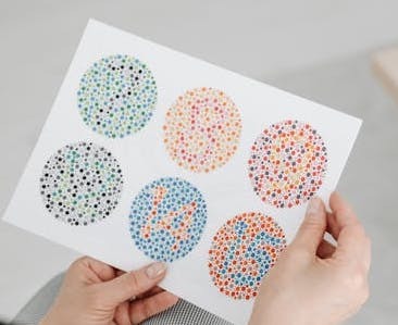
But a quick tip, don’t use red and green together in your text design. People with colour blindness often can’t distinguish between the two, which I learned the hard way.
Red: Danger, Speed, and Power
Red is also the colour of speed, danger, and power. Think red sports cars (there’s a myth they go faster, right?), red lipstick, and red warning signs. STOP signs are red for a reason, they’re meant to grab your attention immediately. Red is confidence personified.
While I’ve never owned a red car myself, I’ve always admired them, there’s just something irresistible about a fire-engine-red Lamborghini. Whether in vehicles, fashion, or branding, red screams "look at me." I have certainly owned my share of red coats, jackets, dresses and red patent hight heels!
Red in Art: Less Is Often More
As a New Zealand artist, I’ve learned that a little bit of red goes a long way in a painting. It’s such a strong colour that even a small touch can create emphasis and drama. Red can anchor a piece, bring warmth, or express energy.
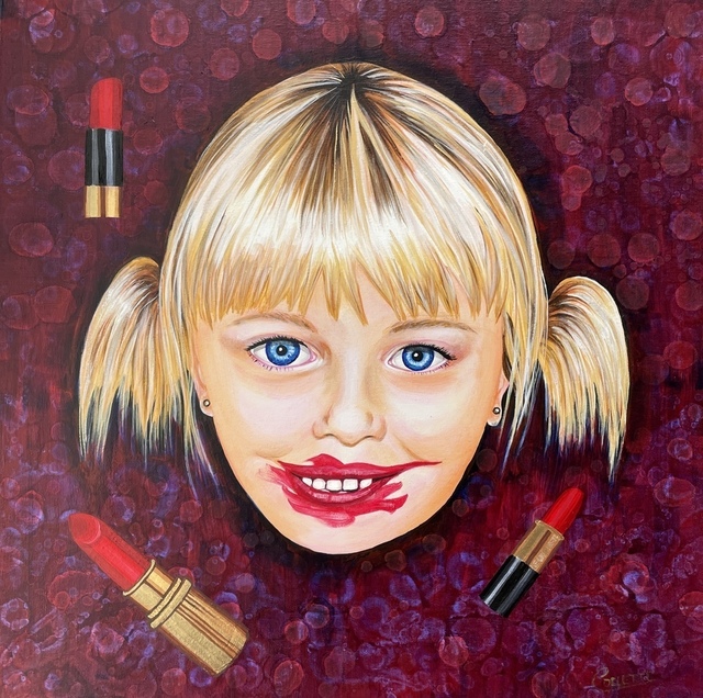
You can mix multiple shades, adding in pinks and oranges—to create a cheerful, dynamic palette. One artwork I once saw that stuck with me was based entirely around shades of lipstick. It was so striking and effective, proving how versatile red really is.
Here is my Lipstick Girl Painting featuring one of my daughters:
The Cultural and Historical Dark Side of Red
Not all associations with red are positive. While it's a colour full of life and celebration, red also carries some heavy, often somber, connotations around the world.
Mourning and Death
In South Africa, red is traditionally associated with mourning and grief. It’s often used in funerals and in the attire of those who are grieving.
Unlike in Western cultures, where black is the standard colour of mourning, red in parts of Africa symbolises the blood of life that has been lost, connecting the colour with the spiritual realm and the seriousness of death.
Revolution and Political Power
Historically, red has been used as a colour of revolution, resistance, and political ideology. In Russia, the red flag became the emblem of the Bolsheviks during the 1917 October Revolution, symbolising the blood of the working class spilled during their fight against oppression.
Following their rise to power, red became permanently tied to communism, and this association continues today across many former Soviet and communist states.
The word "red" in fact became shorthand for communists and leftist ideologies during the 20th century, especially during the Cold War, where Western countries often referred to communist threats as “the red menace.”
War and Violence
Red has long been the colour of warfare, representing bloodshed and violence. Many historical military uniforms, particularly those of British "Redcoats," used red both for visibility and intimidation on the battlefield. Its connection to blood made it a natural choice for battle symbolism across cultures.
Rebellion and Gangs
In modern society, red has also been adopted by gangs and rebellious movements, especially in urban contexts. In New Zealand, as in other countries like the United States, red is associated with specific gang affiliations, such as the Bloods internationally and local gang chapters like the Mongrel Mob, who often wear red bandanas or clothing as a form of identification and group solidarity.
This gang-related use of red gives the colour a more dangerous, rebellious, and sometimes intimidating undertone. For many, especially in certain communities, red worn in public spaces can be interpreted as a statement, intended or not.
Warning and Aggression
Across cultures, red is universally used to signify warning and danger, from traffic signs and hazard labels to red alert systems in emergencies. Its ability to command attention makes it effective, but this also reinforces its link to aggression, caution, and heightened emotional states like anger or fear.
Common Expressions Featuring Red
When Red Is Good
-
Painting the town red – Celebrate in style!
-
Red carpet treatment – Make someone feel like a star.
-
Red sky at night, sailor’s delight – Good weather is coming.
-
Red Letter Day – A special, memorable occasion.
-
Red eye – A rough overnight flight, especially in economy class.
When Red Is Bad
-
Seeing red – Feeling intense anger.
-
In the red – Financial trouble, like an overdrawn bank account.
-
Red herring – A misleading distraction.
-
Red flag – A warning or sign of danger.

Using Red in Your Artwork
Some quick artist tips:
-
Red pigments often fade with light exposure, especially on white backgrounds. Visit any art meseum and you will see a lot of older artworks that apeear muted browns and no trace of red, this is because of the pigment fading away. This is also the case in hairdressing, the red molecule is much smaller than others and therefore washes out much quicker than other colours, hense the fade. If you’re using a non-permanent pigment, apply it full-strength for better longevity.
-
Want to lighten red? Use transparent whites like zinc white rather than opaque ones (which will turn it into various shades of pink unless thats what you're after of course).
-
To make red appear even brighter, use its complementary colour, green. But again, avoid this combo in text-based designs for accessibility.
Types of Red (In Alphabetical Order)
Here’s a handy reference of various reds and their artistic characteristics:
Alizarin Crimson
A dark, cool, transparent red that leans toward purple. Great for glazing and adding depth.
Cadmium Red
Comes in light, medium, and deep. Strong, warm, and opaque with high tinting power. Toxic, so handle with care.
Carmine (Crimson Lake)
Traditionally not lightfast but now available in permanent versions.
Earth Reds
Think red ochre, red oxide, Mars red, burnt sienna, terra rosa. These are warm, natural pigments often related to browns.
Indian Red
A warm, opaque earth red with a bluish undertone. Best used with transparent colours for mixing.
Quinacridone Red
Synthetic, deep, and rich. Mixes well into purples with ultramarine or Payne’s grey.
Rose Madder
A beautiful, transparent red made from the madder root. Often labelled as Madder Lake.
Scarlet Lake
Bright and intense, with a blue undertone. Excellent for glazing.
Venetian Red
A warm, earthy red closer to orange. Made from natural or synthetic iron oxide.
Vermilion
Bright and intense, made from mercury and sulphur. Now available as a safer “hue” alternative.
Red is a colour of emotion, action, and expression. As a New Zealand artist, it’s one of the most powerful tools in my creative toolbox. Whether you’re wearing it, painting with it, or simply admiring it, red is the colour that won’t be ignored. Bold, beautiful, and often misunderstood, it’s a colour that deserves your attention.
Why Not Check Out Some Other Blog Colours Too -
50 Powerful Shades Of Grey? The Thrilling Colours In Art
Beautiful Blue: The depth of Sea to the Sky and Beyond
In the Pink: Celebrating Valentines Passionate Colour
Shades of Purple: A Trip into the World of Royalty
Stunning Silver: The Best Metallic Colour with Class and Glamour
The Best of Black: The Mysterious and Luxurious Shade
The Gloriousness of Gold: Unleashing its Luxury and Passion
Yellow: The Happy Glowing Hue That Makes Warmth, and Inspiration
What Is The Colour Burgundy Or Claret, Colours Or Wines?
Whiter Shade of Pale: Exploring the Simplicity of White
Blazing with Energy: Embracing the Fiery Spirit of the Color Orange
Glorious Green: The Awesome Yet Envious Colour of Emeralds
And while you’re here, check out - Touching on Colour Mixing