In the vibrant tapestry of colours, let's turn our attention to yellow's sunny personality. As one of the three primary colours, it takes centre stage on the warm side of the spectrum, bringing with it a palette of possibilities that can transform and illuminate the canvas of your creativity.
What's more, yellow is not merely a standalone hue; it's a versatile collaborator in the world of colour alchemy. When added to red, it conjures the lively warmth of orange; with blue, it dances into the realm of verdant greens. This makes yellow an ideal companion, a colour that works its magic best when intertwined with others.
Picture replacing red or orange with a bright yellow to inject excitement, tempering the intensity of the former while maintaining a dynamic energy.
Consider yellow not just as a foreground colour but as the silent force beneath the surface. Utilise it as a base coat or underpainting, and witness how it imparts warmth to your artwork. Even if the top layer contains no trace of yellow, it has a subtle way of glowing through, adding a touch of radiance to the overall composition.
Colour-Mixing With Yellow
Experimentation is the key when working with yellow. Introduce yellow to enliven a subdued palette of blues or greys, breathing life into the composition.
Yellow's visibility isn't just artistic; it has practical applications, too. Bright sunshine yellow is the easiest colour for people to perceive. Even those deemed 'colour blind' to other hues often find clarity in yellow. This heightened visibility explains its prevalence in hazard signs and emergency vehicles, a role once dominated by red. Our fire engines, for instance, have transitioned to yellow, considered the epitome of visibility.
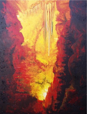
Beyond aesthetics, yellow carries symbolic weight. It embodies wisdom, a hue favoured by those with discerning intellects. Yellow is a beacon of joy and happiness, overflowing with creative and intellectual energy. It is the colour of choice when it comes to decision-making and mental well-being. Whether adorning your living space or clothing yourself in its sunny embrace, yellow brings clarity and guards against the shadows of depression and lethargy.
As you embark on your artistic journey, don't shy away from the radiance of yellow. Plant a bunch of daffodils or yellow roses in your studio, or better yet, let the canvas be your garden, painting with the joyful hues of yellow. After all, in the spectrum of colours, yellow is not just a colour; it's a celebration of creativity and the sunshine within.
Mixing yellow with other colours can produce a wide range of hues, each with its own unique charm.
Here's a list of colours you can achieve by combining yellow with different partners:
- Orange: Mix yellow with red to create orange's vibrant and warm tones.
- Green: Combine yellow with blue to produce an array of lively and nature-inspired greens.
- Yellow-Green: A subtle and fresh colour results from mixing yellow with a touch of green.
- Chartreuse: Blend yellow with a bit of green for a vibrant, slightly yellowish-green shade.
- Lemon Yellow: A pure and bright yellow achieved without any additional colour mixing.
- Mustard: Introduce a touch of brown to yellow for the rich and earthy tones of mustard.
- Peach: Combine yellow with a hint of red and white for soft and delicate peach tones.
- Gold: Mix yellow with a touch of brown or orange for a luxurious and warm gold hue.
- Olive Green: Blend yellow with dark green or brown for the muted and earthy tones of olive.
- Turquoise: Introduce yellow to blue for a refreshing and vibrant turquoise shade.
- Lime Green: A lively and bright green is achieved by adding yellow to a base of green.
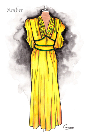
- Amber: Mix yellow with a touch of orange and brown for a warm and glowing amber colour.
- Citron: Combine yellow with a touch of green for a pale and citrusy yellow-green shade.
- Avocado: Introduce yellow to a deep green or brown for the rich and creamy tones of avocado.
- Buttercream: Blend yellow with white for a soft and creamy off-white hue.
Experimenting with these colour combinations can open up a world of possibilities in your artistic endeavours. Whether you're aiming for bold contrasts or subtle harmonies, adding yellow can bring warmth and vibrancy to your palette.
Just For Fun: What's a Good Yellow?
- Yellow Brick Road – The path to adventure, inspired by "The Wizard of Oz."
- Yellow Submarine – Join the Beatles in their vibrant underwater vessel.
- Mellow Yellow – A laid-back and easygoing state of mind.
- Yellow Fever – The craving for all things bright and cheery.
- Banana Hammock – Not just a tropical fruit holder; it's a humorous term for a certain style of swimwear.
- Big Bird – The iconic yellow-feathered character from Sesame Street.
- Yellow Journalism – News with a sensationalised and exaggerated twist.
- Yellow Pages – The pre-digital era's go-to directory for finding businesses.
- Yellow Belly – A playful term for someone who's a bit timid or cowardly.
- Yellowstone National Park – Nature's masterpiece of geysers, hot springs, and wildlife.
What's a Bad Yellow?
- Yellow Fever – In its literal sense, it's a severe mosquito-borne disease.
- Yellow Journalism – When media sensationalises news for attention rather than accuracy.
- Yellow-bellied Snake – A venomous serpent with a distinctive yellow underside.
- Yellow Snow – The less appetising version of winter wonderland.
- Cowardly Yellow – A twist on the classic "yellow-belly" insult.
- Yellow Flag – Signaling caution or warning in sports and racing.
- Yellow Card – A cautionary card in soccer, signalling a player's misbehaviour.
- Yellow Fever Phobia – An irrational fear of the colour yellow.
- Yellow Teeth – Not the best indicator of dental hygiene.
- Yellow Journalism Award – A dubious honour for the most sensationalised reporting.
At the end of the day, yellow brightens your day, whether in the cheerful or quirky shades of life!
Why Not Check Out Some Other Colours Too -
50 Powerful Shades Of Grey? The Thrilling Colours In Art
Beautiful Blue: The depth of Sea to the Sky and Beyond
In the Pink: Celebrating Valentines Passionate Colour
Shades of Purple: A Trip into the World of Royalty
Stunning Silver: The Best Metallic Colour with Class and Glamour
The Best of Black: The Mysterious and Luxurious Shade
The Gloriousness of Gold: Unleashing its Luxury and Passion
What Is The Colour Burgundy Or Claret, Colours Or Wines?
Whiter Shade of Pale: Exploring the Simplicity of White
Rich as Red: Exploring its Many Fiery Shades
Blazing with Energy: Embracing the Fiery Spirit of the Color Orange
Glorious Green: The Awesome Yet Envious Colour of Emeralds
And while you’re here - Touching on Colour Mixing