Green: The Color of Renewal, Growth, and Harmony
What does green mean to you? For many, it evokes images of lush fields, rolling hills, and verdant forests. In fact, green is a colour associated with growth, renewal, and harmony, and let's not forget about being environmentally aware. It's also a versatile colour that can convey various emotions and messages.
From Nature to Psychology: The Many Meanings of Green
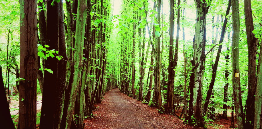
Green is the colour of nature, and it's no surprise that it's one of the most common colours in the natural world. It's the colour of leaves, grass, and moss. Green is also associated with life, renewal, and growth. In many cultures, it's considered a sacred colour representing balance and harmony.
But green isn't just a colour of positivity. It also has negative associations, such as the "green-eyed monster" of jealousy. Green can also represent sickness or envy.
However, when used in interior design or branding, green is often used to evoke positive feelings. It's calming, soothing, and easy on the eyes. Hospitals often use shades of green to create a peaceful environment.
Different Shades of Green and Their Meanings
Green is a complex colour with many shades and meanings. For instance, olive green can give a military feel. In contrast, a lime green palette can create a fresh and fruity atmosphere. Green used alongside blue can develop thoughts of nature, as in water and trees. Green used with brown, tan, or beige can denote organic or recycled goods.
Green is also a popular colour in sports and fashion. Tri-colour combinations of green with yellow and black or white are considered sporty, outdoorsy sorts of colours.
Choosing the Right Green for Your Art
When it comes to painting, there are many shades of green to choose from. Some popular options include phthalo green, Courbet green, chromium oxide, cobalt titanate green, viridian, permanent green, cadmium green, emerald, olive, mint, moss, jade, leaf green, aquamarine, sea green, sea-foam, pea green, grass green, apple, forest, lime, spring green, chartreuse, fir, kelly green, pine, sage, sap, and Veronese.
Paint Ranges: The Differences
Different paint ranges have other names, but you can always mix your desired shade. For example, several shades of green are good for a fresh springtime feel when using green. For example, a wash of green in the background of skin tones can produce a bright skin tone, a trick used by the great masters.
What does green mean to you? It has many connotations; it can mean life and renewal, as in spring growth, or how about being green, where you look after the environment, which also leads to being green-thumbed, where you are good with plants. There is also the negative aspect in that there is the green-eyed monster to signify jealousy, or being 'green' can mean being inexperienced and new to something.
Green itself is a restful colour with some of the same calming attributes of blue and is often used in places like hospitals, where it gives peace and calm to unwell people.
Because of all the green in nature, the colour is reminiscent of spring. However, for us in New Zealand, it also signifies summer or even all year round with our rolling green hills and countryside.
Put green together with red, and it becomes a Christmas colour.
My Work
When I worked in oils, I favoured viridian green; its rich deep tones achieved the effect I required in my scenic pieces. It was a popular choice on my palette, along with sap green. Permanent green works best for my work today because of its lighter, brighter properties.
Several shades of green are suitable for a fresh, Springtime feel when using Green.
Olive green gives those military overtones, while green, used along with blue, produces thoughts of nature, as in water and trees and can denote new beginnings and growth. Put green with brown, tan, or beige to characterise organic or recycled goods tri-colour combinations of green with yellow and black or white are considered sporty, outdoorsy sorts colours. Purple with green can be a high-contrast combination. Try lime green with orange and yellow for a fresh, fruity citrus palette.
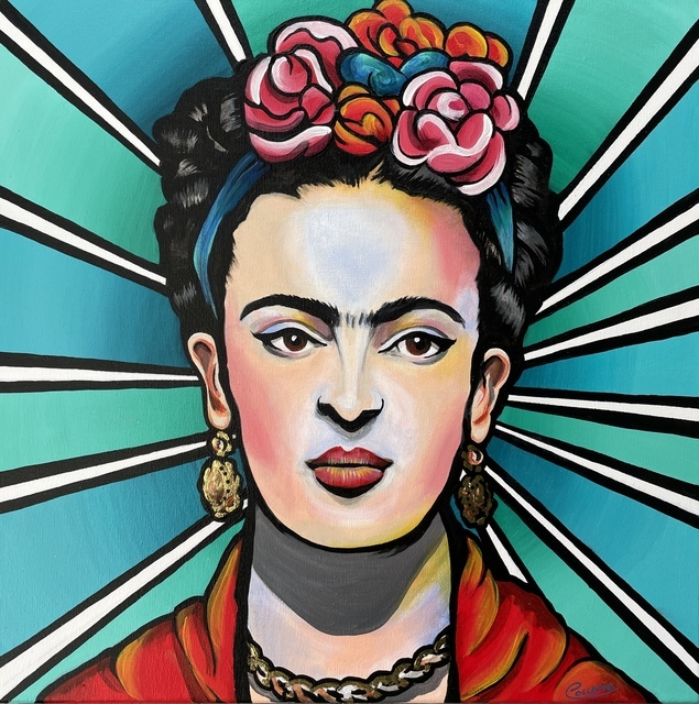
In my portraits, I use a wash of green in the back of skin tones to produce a bright skin tone, a trick I learnt from the great masters, although Im yet to perfect portraits! Even though you can't see it well, there's green in this Frida Kahlo Portrait of mine.
Types of Green –
Phthalo Green, Courbet green, Chromium Oxide, Cobalt Titanate Green, viridian, permanent green, cadmium green, emerald, olive, mint, moss, jade, leaf green, aquamarine, sea green, sea-foam, pea green, grass green, apple, forest, lime, spring green, chartreuse, fir, kelly green, pine, sage, sap, Veronese.
Different paint ranges have other names but remember you can always mix your desired shade.
At the end of the day, green is a versatile and complex colour that conveys many emotions and meanings. From nature to psychology, green has a deep and rich history of symbolism. So whether you're looking to create a peaceful environment, evoke positive emotions, or simply add a fresh touch to your art, green is a colour that should not be overlooked.
Why Not Check Out Some Other Colours Too -
50 Powerful Shades Of Grey? The Thrilling Colours In Art
Beautiful Blue: The depth of Sea to the Sky and Beyond
In the Pink: Celebrating Valentines Passionate Colour
Shades of Purple: A Trip into the World of Royalty
Stunning Silver: The Best Metallic Colour with Class and Glamour
The Best of Black: The Mysterious and Luxurious Shade
The Gloriousness of Gold: Unleashing its Luxury and Passion
Yellow: The Happy Glowing Hue That Makes Warmth, and Inspiration
What Is The Colour Burgundy Or Claret, Colours Or Wines?
Whiter Shade of Pale: Exploring the Simplicity of White
Rich as Red: Exploring its Many Fiery Shades
Blazing with Energy: Embracing the Fiery Spirit of the Color Orange
And while you’re here - Touching on Colour Mixing is an interesting post on how to mix colours.