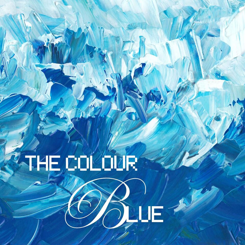
Beautiful Blue: The depth of Sea to the Sky and Beyond
As a New Zealand artist, I'm captivated by the symphony of colours and shades at our disposal. Blue, often revered as a crowning jewel in the colour palette, holds a unique place. It may not top my personal list, as it's often associated with coldness and melancholy, leading me to use it sparingly in my creations. However, to overlook the power and versatility of this captivating colour would be a true disservice.
What Is Blue?
Blue, a member of the holy trinity of primary colours, holds a unique place in the spectrum. Unlike the fiery warmth of red, its position on the cool side imbues it with a calming serenity. It can morph into a spectrum of personalities, from the bold and unwavering to the light and friendly. Just like the saying "seeing red" suggests the intense emotions it evokes, "feeling blue" or having "the blues" reflects the profound calmness associated with blue – a state of quiet rather than fiery emotions.
This colour of the collective spirit invokes a sense of tranquillity and is even known to stimulate the production of those calming chemicals we all love, in our bodies. But wait! Not all blues exude serenity. Electric or vibrant blues take on a dynamic and dramatic flair, grabbing the viewer's attention. They're stars in abstract works that need passionate energy without resorting to red.
While certain shades or overuse of blue can hint at coldness, aloofness, or even indifference, here's a surprising fact: blue is the least gender-biased colour. Often associated with baby boys, it retains its charm for both men and women well into adulthood. Think about it, you would have items of blue in your wardrobe and quite likely not just the staple jeans most people have.
The Colour Blue In The Artist's World
When it comes to artists, blue is not just a colour but a tool for creating depth and perspective. Deep, royal blues or azure hues are an artist's weapon of choice to convey richness, vastness, and maybe even a touch of grandeur.
Dark blues, like navy bordering on black, possess a surprising warmth compared to their lighter counterparts. And while blue is a perennial colour, pastel blues, especially when paired with pinks and pale yellows, evoke the freshness of spring, while deeper blues are more at home in the cooler seasons.
The possibilities are truly endless when it comes to combining blue with other colours. Mixing blue with green creates a natural, watery palette while adding grey lends an understated elegance. When paired with neutral light browns like tans or beige, Sky blue and Robin's egg blue create a nature-inspired colour harmony.
Consider using dark blue alongside crisp whites for artwork with a nautical theme. The classic red, white, and blue trio ignites patriotic connotations, making it a popular choice in countries like the United States. And to add a touch of sophisticated luxury, complementing dark blue with metallic silver accents.
The Range of Shades Within the Blue Spectrum is Nothing Short of Extraordinary
The spectrum of blues is nothing short of extraordinary. Here's a taste of this chromatic abundance:
- Royal blue – fit for a king (or queen)
- Sapphire blue – the rich jewel tone
- Baby blue – soft and innocent
- Sky blue – clear and limitless, like a summer sky
- Robin's egg blue – a gentle, calming blue
- Navy blue – deep and sophisticated
- Midnight blue – the colour of the deep night sky
- Slate blue – a touch of grey mixed in for a moodier feel
- Cobalt blue – intense and vibrant, like a peacock feather
- Cornflower blue – a bright, cheerful blue
- Indigo blue – deep and mysterious, like twilight
- Wedgwood blue – a pale, elegant blue named after a famous pottery company
- Powder blue – a soft, muted blue
- Azure blue – clear and bright, like a tropical lagoon
- Ultramarine blue – a rich, intense blue used by artists for centuries
- Aquamarine blue – the calming colour of the ocean
- Air-force blue – a dark, crisp blue
- Cerulean blue – a clear, heavenly blue
- Turquoise – a captivating blend of blue and green
- Powder blue – a very pale, almost dusty blue
- Electric blue – bold and eye-catching
- Denim blue – the colour of our favourite jeans
- Lapis lazuli blue – a luxurious blue with flecks of gold, prized since ancient times
- Prussian blue – a deep, rich blue developed in 18th-century Prussia
- Periwinkle blue – a light, playful blue
While these shades are commonly found in artist's paints, it's important to remember that colour names and ranges can vary significantly across brands. So, a little caution is advised when seeking specific colours or consistent colour quality.
Why Not Check Out Some Other Colours in my Blog Too -
50 Powerful Shades Of Grey? The Thrilling Colours In Art
In the Pink: Celebrating Valentines Passionate Colour
Shades of Purple: A Trip into the World of Royalty
Stunning Silver: The Best Metallic Colour with Class and Glamour
The Best of Black: The Mysterious and Luxurious Shade
The Gloriousness of Gold: Unleashing its Luxury and Passion
Yellow: The Happy Glowing Hue That Makes Warmth, and Inspiration
What Is The Colour Burgundy Or Claret, Colours Or Wines?
Whiter Shade of Pale: Exploring the Simplicity of White
Rich as Red: Exploring its Many Fiery Shades
Blazing with Energy: Embracing the Fiery Spirit of the Color Orange
Glorious Green: The Awesome Yet Envious Colour of Emeralds
The Warmth of Beautiful Brown: From buff to Bronze
And while you’re here take a look at - Touching on Colour Mixing
Posted: Sunday 28 February 2010