Blazing with Energy: Embracing the Fiery Spirit of the Color Orange
Orange is one of the most vibrant colours in the artist's palette. It's a red and yellow blend between these two hues on the colour spectrum or wheel. Naturally, it shares some attributes with both red and yellow. Orange denotes energy, warmth, tropical fruit, and the sun. Unlike the intense aggression of red, orange is tempered by yellow's lighter, more cheerful attributes.
As a warm colour, orange is a stimulant; it invigorates the emotions and even the appetite, making it an excellent choice for restaurants and cafes. Orange is omnipresent in nature: the changing leaves of autumn, the glowing pumpkins of Halloween, the rich hues of the setting sun, and the vibrant skin and flesh of citrus fruits, especially oranges.
Orange symbolises the transition between seasons. It captures the shift from the bold, bright oranges and yellow oranges of summer to the warm, burnt oranges and red oranges of autumn, leading into winter. This makes orange a colour of change, embodying the dynamic essence of nature's cycles.
Using Orange in Art
If you want to get noticed without screaming 'Look at me', consider using orange. It demands attention without the brashness of red or the glitter of metallics. Softer shades like peach are more soothing and less flamboyant than their redder counterparts, yet still energetic.
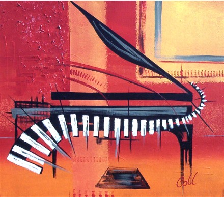
In abstract art, like Collette, a New Zealand contemporary artist's piano painting(below) featuring orange, this colour can indicate transitions or serve as a bridge between contrasting elements. Its presence adds a vibrant, dynamic energy to the artwork.
How to Use Orange with Other Colours
While orange and black are iconic Halloween colours, pairing orange with its complementary colour, blue, can create a striking contrast. Combining orange with reds and yellows can produce a fiery, hot palette or a fresh, fruity look in softer shades.
When teamed with greens, orange evokes a tropical feel. However, mixing it with pink can produce a vibrant, 60s psychedelic vibe. Try pairing orange with rich purples, lots of yellows, or whites for an exciting and harmonious combination.
'The Piano' abstract art by Collette Fergus
Orange Colour Palettes
The range of orange shades in paint is extensive, each offering its unique tone and character:
- Pumpkin: This rich, earthy orange, reminiscent of autumn pumpkins, is perfect for adding warmth and a seasonal touch.
- Gold: A warm, metallic orange that exudes luxury and opulence, often used to highlight and add richness.
- Flame: A vibrant, fiery orange that brings intense energy and passion to any composition.
- Copper: A reddish-orange with metallic undertones, ideal for creating a rustic, industrial feel.
- Brass: A yellowish-orange with a metallic sheen, often used to convey a sense of aged elegance and durability.
- Apricot: A soft, pale orange with hints of pink, offering a gentle, soothing presence.
- Peach: A light, pastel orange with a hint of pink, creating a calming and inviting atmosphere.
- Citrus: A bright, zesty orange that evokes freshness and vibrancy, perfect for lively and energetic themes.
- Tangerine: A bold, saturated orange that stands out with its vivid, juicy appearance, bringing a sense of fun and playfulness.
The complementary colour to orange is azure blue, a slightly greenish blue. Orange pigments primarily come from the ochre or cadmium families, absorbing mostly blue light.
Burnt orange, with its darker brown overtones, was particularly popular in the 1970s, especially in interior design. This shade often evokes nostalgia for that era. Interestingly, "redhead" usually refers to the burnt orange hue rather than true red when discussing hair colour.
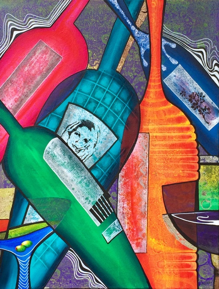
 'That 80s Cocktail Bar' abstract art by Collette Fergus
Fun Facts about the Colour Orange
Orange is a colour rich with history, cultural significance, and unique characteristics. Its dynamic presence and versatility have made it a favourite among artists and designers. Here are some fun and intriguing facts about this vibrant hue that will surely inspire your next artistic creation:
- Unrhymable Word: Did you know that orange, purple, and silver are often cited as a word with no perfect rhyme in the English language? However, the Oxford Rhyming Dictionary does provide half-rhymes, like "lozenge" with orange and "salver" with silver.
- Underpainting: In painting, underpainting with orange can imbue your artwork with a warm glow. However, avoiding using it under skin tones in portraiture is best, as it can result in an unnatural appearance.
- Cultural Significance: In many cultures, orange holds significant meaning. For example, in Hinduism, saffron (a shade of orange) is considered sacred and represents purity and spirituality.
- Orange in Nature: The color orange is prevalent in nature, from the vibrant hues of autumn leaves to the striking feathers of birds like the oriole and the wings of monarch butterflies.
- Orange is often associated with enthusiasm, creativity, and success. It's a colour that can uplift and energise, making it popular in marketing and branding. Its psychological impact can bring a sense of positivity and energy to your work.
- Safety Colour: Due to its high visibility, orange is used for safety gear and high-visibility clothing, ensuring that wearers stand out in potentially dangerous environments.
- Orange pigment has been used in art for centuries. In ancient Egypt, artists used a natural pigment called realgar to create orange hues in their artwork. This rich history of use in art connects us to a long tradition of artistic expression.
- Fruit Origins: The colour orange is named after the fruit, not vice versa. The word "orange" actually comes from the Old French "pomme d'orange."
- National Colour: In the Netherlands, orange is the national colour derived from the Dutch royal family, the House of Orange-Nassau.
- Healing Properties: In some holistic healing practices, orange is believed to increase energy levels and promote a sense of general well-being.

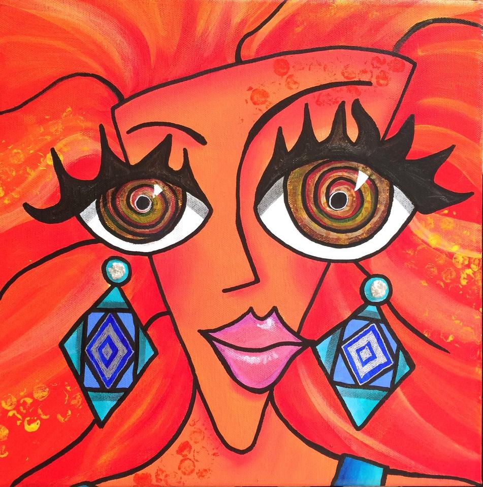
In this painting titled 'Hypnotic Redhead' you can see the contrast of Orange & Azure blue.
At The End Of The Day
With its dynamic and versatile nature, orange continues to captivate and inspire artists across various mediums. Its ability to evoke a wide range of emotions—from the fiery passion of a sunset to the soothing calm of a peach—makes it an indispensable colour in any artist's palette.
Whether used boldly or subtly, orange brings a vibrant energy to any artwork. In bold applications, it demands attention, creating focal points and adding dramatic flair. In softer, more nuanced uses, orange can warm a composition, adding depth and richness without overwhelming the viewer. Its natural presence in the changing seasons, tropical fruits, and cultural symbols provides endless inspiration for artists seeking to capture the essence of life's transitions and vibrancy.
Incorporating orange into your work can highlight contrasts, bridge different elements, and add a touch of excitement and warmth. From abstract compositions to realistic portrayals, orange's versatility allows it to play a starring role or a supportive character, enhancing other colours and bringing balance to a piece.
Orange not only enriches visual art but also carries psychological and cultural significance, making it a powerful tool for artists to communicate their vision. Its association with creativity, enthusiasm, and transformation makes it a perfect choice for those looking to infuse their work with a sense of energy and movement.
In conclusion, orange is more than just a colour; it is a dynamic force that breathes life into art. Its vibrant energy and multifaceted nature make it a timeless and essential element in the world of creativity. Whether you're painting a serene landscape or an energetic abstract piece, consider the power of orange to elevate your work and captivate your audience.
Why Not Check Out Some Other Colours Too -
- 50 Powerful Shades Of Grey? The Thrilling Colours In Art is grey just a shade?
- Beautiful Blue: The depth of Sea to the Sky and Beyond the opposite or complimentary of orange on the colour spectrum
- In the Pink: Celebrating Valentines Passionate Colour such a pretty colour right?
- Shades of Purple: A Trip into the World of Royalty another secondary colour
- Stunning Silver: The Best Metallic Colour with Class and Glamour
- The Best of Black: The Mysterious and Luxurious Shade
- The Gloriousness of Gold: Unleashing its Luxury and Passion
- Yellow: The Happy Glowing Hue That Makes Warmth, and Inspiration one of the colours that creates orange
- What Is The Colour Burgundy Or Claret, Colours Or Wines? The most commonly quiered colour
- Whiter Shade of Pale: Exploring the Simplicity of White
- Rich as Red: Exploring its Many Fiery Shades the other colour that makes up orange
- Glorious Green: The Awesome Yet Envious Colour of Emeralds
And while you’re here - Touching on Colour Mixing

