Did you know that the human eye can distinguish about 500 shades of gray? Gray represents everything between black and white, symbolising neutrality and balance.
The Meaning and Symbolism of Gray
Gray is the colour of intellect, its about knowledge, and its about wisdom. It is perceived as classic, refined, and sophisticated. Because it sits between the extremes of black and white, gray is often associated with compromise, neutrality, and stability.
It is a controlled and inconspicuous colour, usually linked to professionalism, elegance, and even mystery.
Gray, with its ability to evoke different emotions depending on its shade, is a color of intriguing complexity. Light grays can create a calming and airy atmosphere, while darker grays can instill a sense of strength, seriousness, or even melancholy.
This emotional versatility is one of the many reasons why gray is commonly used in design and fashion, adding depth and interest to any creative project.
The Spelling: Gray vs. Grey
Before going further, let's address the common question regarding spelling: is it "gray" or "grey"? Both spellings are correct, but their usage varies. "Gray" is apparently the preferred spelling in American English, while "grey" is commonly used in British English and other Commonwealth countries.
Much like "organize" vs. "organise" or "judgment" vs. "judgement," the difference is regional rather than meaningful. Use whichever spelling feels the most natural to you!
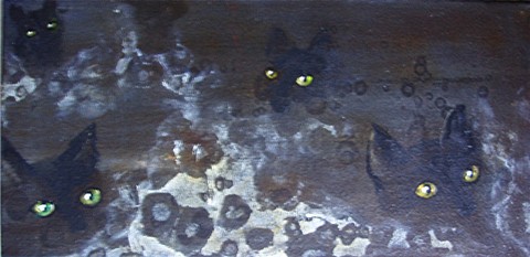
Black Cat Night
Different Shades of Grey
Gray comes in two primary tonal variations:
- Cool Gray: Contains blue undertones, creating a more steely and crisp appearance.
- Warm Gray: Has yellow or brown undertones, offering a softer, more inviting feel.
All shades of gray can serve as excellent neutral background colours. Lighter grays can substitute for white, while darker grays can replace black to create a softer contrast.
Here are some notable shades of gray:
- Charcoal – A deep, dark gray with black undertones.
- Slate – A medium-dark gray with a slight blue hue.
- Iron – A strong, metallic gray reminiscent of industrial materials.
- Ashen – A pale, dusty gray, resembling ash.
- Lead – A deep, muted gray, similar to the metal.
- Mousy – A soft, muted gray-brown.
- Gunmetal – A dark gray with a metallic sheen.
- Silver – A luminous, reflective gray, often associated with prestige.
- Dove Gray – A soft, light gray, named after the color of doves.
- Powder Gray – A very pale, almost white gray.
- Oyster – A warm, soft gray with beige undertones.
- Pearl – A shimmering light gray with hints of white.
- Taupe – A grayish-brown neutral with an earthy quality.
- Sere – A faded, desaturated gray tone.
- Payne's Gray – A deep, moody gray with a blue undertone, commonly used in painting.
The Historical Significance of Gray
Throughout history, gray has held varied meanings across different cultures and periods:
- Medieval Europe: Gray was the colour of humility and modesty, often worn by monks and the poor.
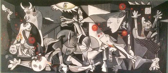
- Renaissance & Baroque Periods: Artists used gray for underpainting, a technique called "grisaille," to establish tonal values before adding colour.
- The Industrial Revolution: Gray became associated with machinery, progress, and urban landscapes, as cities were often filled with smoke and soot.
- The 20th Century: Gray was a dominant colour in modernist architecture and design, symbolising minimalism and functionality.
Gray in Art and Design
Gray is widely used in art, interior design, and fashion for its versatility. It pairs well with almost any colour:
- Light gray with pastels (pink, blue, lavender, green) creates a soft, feminine aesthetic.
- Darker gray tones combined with navy, burgundy, or forest green evoke a more masculine, sophisticated feel.
- Gray with hot pink is often seen as a retro, playful combination.
- Warm reds or golden yellows paired with gray create a balanced, inviting look.
A Final Thought on Gray
Let's end with a quote from the renowned sculptor and painter Alberto Giacometti:
"If I see everything in gray, and in gray all the colours which I experience and which I would like to reproduce, then why should I use any other colour?
I've tried doing so, for it was never my intention to paint only with gray. But in the course of my work, I had eliminated one colour after another, and what remained was gray, gray, gray!" Every artist goes through phases; mine was the gray period.
Gray is not just a neutral, it is a powerful, expressive colour that holds depth and complexity. Whether used in fashion, design, or art, it remains a timeless and influential shade.
Why Not Check Out Some Other Colours Too -
Beautiful Blue: The depth of Sea to the Sky and Beyond
In the Pink: Celebrating Valentines Passionate Colour
Shades of Purple: A Trip into the World of Royalty
Stunning Silver: The Best Metallic Colour with Class and Glamour
The Best of Black: The Mysterious and Luxurious Shade
The Gloriousness of Gold: Unleashing its Luxury and Passion
Yellow: The Happy Glowing Hue That Makes Warmth, and Inspiration
What Is The Colour Burgundy Or Claret, Colours Or Wines?
Whiter Shade of Pale: Exploring the Simplicity of White
Rich as Red: Exploring its Many Fiery Shades
Blazing with Energy: Embracing the Fiery Spirit of the Color Orange
Glorious Green: The Awesome Yet Envious Colour of Emeralds
And while you’re here - Touching on Colour Mixing