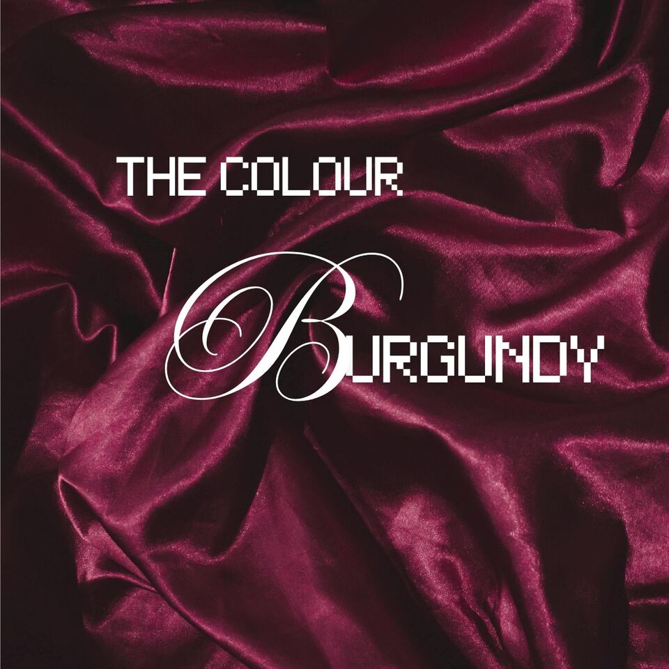
What Is The Colour Burgundy Or Claret, Colours Or Wines?
What is the difference between Burgundy and Maroon?
"Burgundy" and "maroon" or "claret" are often used interchangeably, but they do refer to slightly different shades of red and yes they are that dark colour named after wine! The distinction between the three can vary depending on the context and personal interpretations, and there's some overlap in their usage.
Maroon vs burgundy colour, wine vs burgundy colour, maroon vs burgundy vs wine, they're all pretty much the same. Or are they?
Generally, burgundy, or claret is considered a darker, deeper shade of red with a purplish or wine-coloured undertone. It takes its name from the Burgundy wine produced in the Burgundy region of France. Burgundy often has a more subdued and sophisticated appearance.
On the other hand, maroon is typically described as a dark brownish-red or a deep, reddish-brown colour. It is often associated with the colour of chestnuts. Maroon can be slightly warmer in tone compared to burgundy.
Is Burgundy Red or Purple?
The distinction can be subtle in practical terms, and different people may use the terms interchangeably. It's always a good idea to refer to specific colour codes or Pantone colours if precision is crucial, as the interpretation of colour names can be subjective.
In addition to being a lover of red wine and a New Zealand artist who has painted numerous works with wine bottles or glasses in them, the colour burgundy is one that I am quite familiar with, and one that I am fond of including in my artwork like in the painting below. My use of colours is important to me and this is one example.
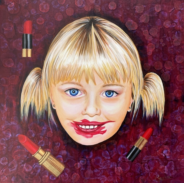
Lipstick Girl by Collette Fergus
When It comes to Wine
To omit the reference to wine would be a disservice. The shades of burgundy are often named after wines, making it easier for you to understand. I will include images so you will have a better understanding of the colour or colours themselves once you have finished reading my article.
On the colour spectrum, burgundy or maroon is a tertiary colour somewhere between red and violet. Getting back to basics red, yellow and blue are your primary colours; while green, purple and orange are the secondary ones created from mixing the primary ones on either side together eg blue and yellow make green.
From there when we start mixing the secondary colours and create tertiary or third level colours that include all three primary colours of red, yellow and blue of varying amounts. They create our burgundy varieties along with the others.
Time to throw an image into the ring so here we have a colour wheel which demonstrates the three levels for you. You can see burgundy/maroon circled. It falls under the category of red/violet because this colour can only be created when red and violet are mixed together.

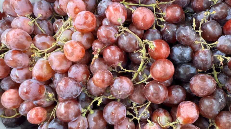
Let's take a look at the wine connection a little more. Burgundy as a colour is a shade of purplish red usually associated with the Burgundy wine of the same name; this comes from the Burgundy region of France where that particular type of wine or grape variant is produced.
As I mentioned before the colour burgundy itself is similar to other shades of dark red such as merlot, claret or shiraz which are common wine names so therefore it is often called wine red, or simply wine. We can’t forget good old Sangria which is also a reddish colour that resembles Sangria wine.
I’ve enjoyed a lovely glass or three of fruit flavoured sangria, over many summers, although watered down with other lighter coloured liquids, it still has that beautiful red colour on the burgundy spectrum. The word ‘sangria’ is Spanish and originates from ‘sangre’ which translates to blood in english. This is an appropriate name considering its colour as lets face it, blood is bordering on a burgundy red. Connections are everywhere right?
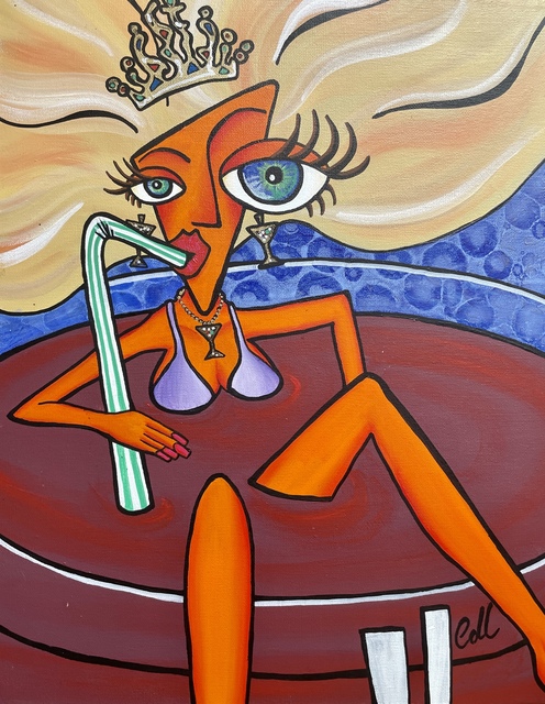
Dina Thirst - Artwork by Collette Fergus
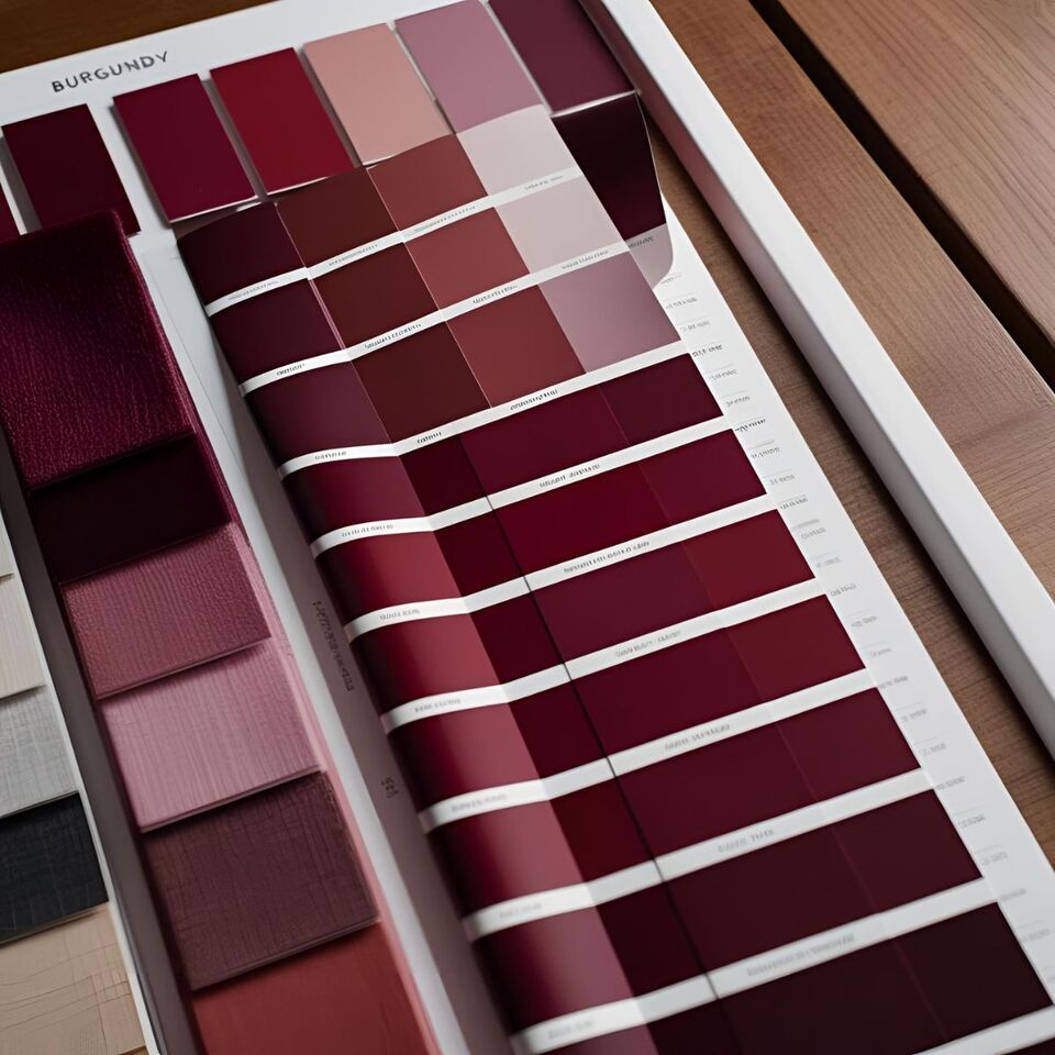
Burgundy, claret, merlot, shiraz or sangria have a major resemblance to dark carmine, crimson and many other dark reds. The image I have included shows the colors of wine. It is classed as a red and sometimes as a violet which does use aspects of violet to create it as we saw on the colour wheel.
The non-red categorisation of this colour could be open for debate however, because its relation to violet is quite vague. If anything, it could be classed more as a dark pink, just a red or even a slight brown
We would classify Claret as an uncommon style of dark rosé, usually pink in colour, rather than a true red or burgundy colour. Until the 18th century, claret was the most common export from the Bordeaux region of France, now it is cabernet sauvignon and merlot blends. In the European Union, Claret is protected in the same way that Champagne is.
The name refers to a red Bordeaux wine made in France. In the United States the word Claret is occasionally used as a semi-generic label for red wine in the style of Bordeaux, ideally of varietals authentic to the region. The French themselves do not use the term, except for export purposes.
I use this color in my artworks to represent wine. I don’t usually use it for anything else. However, it does come up as a popular colour in decorating schemes at times, particullary in the 1980s -1990s. It works well in décor art especially with silver and grey or black such as in this artwork below.
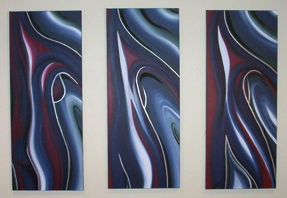
Morph artwork by Collette Fergus
To make claret, maroon or burgundy which is dark red, you will need mainly a red pigment along with a brown pigment at around 8% brown. This will depend on the depth of the pigments you are using. If you want a colour which is like claret wine, you will need to mix in a very small amount of blue as well; I find French ultramarine works best for a good hint of blue.
There are so many levels and options, so you should experiment to find which one suits your purpose.

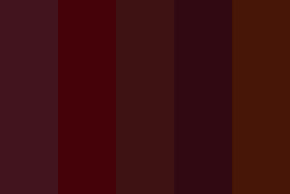
There are different meanings associated with the colors burgundy, maroon, and claret, but all three are types of purple red. If you want to explore this further and need an accurate match for your colour scheme, try Pantone colour guides.
Why Not Check Out Some Other Colours Too -
50 Powerful Shades Of Grey? The Thrilling Colours In Art
Beautiful Blue: The depth of Sea to the Sky and Beyond
In the Pink: Celebrating Valentines Passionate Colour
Shades of Purple: A Trip into the World of Royalty
Stunning Silver: The Best Metallic Colour with Class and Glamour
The Best of Black: The Mysterious and Luxurious Shade
The Gloriousness of Gold: Unleashing its Luxury and Passion
Yellow: The Happy Glowing Hue That Makes Warmth, and Inspiration
Whiter Shade of Pale: Exploring the Simplicity of White
Rich as Red: Exploring its Many Fiery Shades
Blazing with Energy: Embracing the Fiery Spirit of the Color Orange
Glorious Green: The Awesome Yet Envious Colour of Emeralds
The Warmth of Beautiful Brown: Earthy Tones From Buff to Bronze
And while you’re here - Touching on Colour Mixing
Don't forget to take a look at my original nz art for sale in my art website galleries
Posted: Monday 14 June 2010